Wednesday, 13 May 2015

Product Placement


In terms of product placement we believe Lavabo should be positioned on various social media networks as well as having our own websites with similar design and aesthetics to our brand tone of voice so all aspects of the brands are coherent. Having a little explore on Graphics burger and various other sites was helpful in finding a base image that i could work on to position pages from Lavabo's networking sites in order to edit and position on media devices which present our product placement.


Being a lifestyle brand that cares for your delicate fabrics, using a Lavabo label within our packaging and is something to considering when developing the brand, so i believe this Lavabo would be really relevant connecting product and concept as well as being appealing for the target consumer.

Stolen Inspiration Palette


Above are three images taken from a lecture from Michelle that i found really appealing and inspiring. Within the visual awareness module we have been experimenting a lot with photoshop and learning new skills and software within these programmes, but i think its important to not forget the beauty within physical mood boards and not just mood boards of edits created on Photoshop or Indesign. I love texture and things that are tangible and art that you can touch, feel and appreciate. I believe this is really relevant for our brand as we are a brand that cares for your delicates and fabrics in the terms of a washing collection. As development and a post production idea i have experimented with media media and working materials into imagery; hence why i really like these two sets of imagery and believe they are really good examples of combining image and mixed media within work.

This is a piece of imagery stolen from one of Tims lectures when looking ar various ways in which you can alter imagery in post production.

Dior & I


Tonight i went to the Broadway cinema in Nottingham for the first time and its the nicest idyllic little cinema ever. The screen room must of literally been made up of around 30 seats, so great view from all angles, and the bar had a really nice atmosphere that you can pop in for drinks!


The film Dior & I documented Raf Simons 6 week journey to creating his frisky Haute Couture show with Dior in 2012, coming from Jil Sander and previously designing ready to wear, menswear this was a challenge for Simons. But seeing the transition and relationships built within the Dior family gave a really interesting insight into the fashion house. Raf works really closely with Petior who is his right hand man and moved with Simons from Jil Sander to work with the Haute Couture collection.  
The location in which the collection was displayed was a beautiful private house that Dior hired and filled the entire walls and ceilings with flowers in different colours and shades depending on the room, the Art direction of the set up of the show was my absolute favourite aspect of the film. Although i did gasp when the most sublime materials and embroiled fabrics were delivered to the fashion house in order for to ateliers to created the garments with. The designs were spectacular and everyone within the house at Dior are so so talented, some of which have worked there for over 40 years! The location and make up where my favourite, with a simple yet innovative idea for the art direction but due to the sheer amount and quantity of flowers.. it made the show more than memorable!

Well done Raf; still going strong with the Dior fashion house!


Monday, 4 May 2015

Photo shooting!


Logo Development


Graphics Outcome

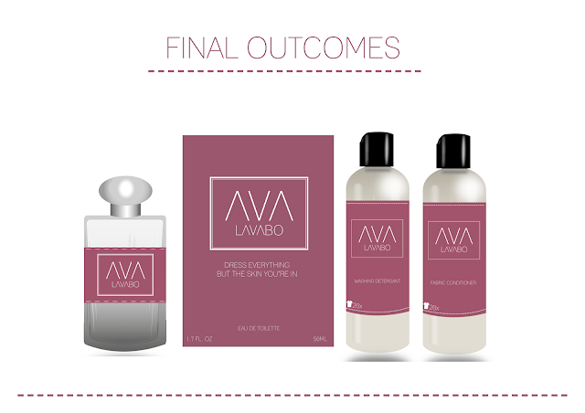
These are the outcomes from briefing the graphics students. There were 4 final sheets presented back to us, all of which were quite different approaches; as there were four students within the briefing. This could be seen at a good thing, as we have different looks and responses in terms of our brief and the packaging ideas. But then it also make things a little more confusing as we will need to plan and decide on the the bottle shapes as the drawings and mock ups are different. 


We really like these as our initial sketches and the symbol on the bottle representing the amount of washes that will take for every bottle of detergent or fabric conditioner was a really nice aspect and design feature. We also liked the cleanness of the sharp shared bottles, as we believe our brand is more appropriate with a minimal and clean design in terms of bottle and the packing should be more tactile and textured. 


We want the delivery of 'Lavabo' to be presented in a nice desired and luxury package, we highlighted this within our brief and this was what the graphics students through would be appropriate. I really like the dust bag that has been designed as this would work really nicely as the design for a draw refresher or wardrobe hangers, so this would definitely be something we could consider in terms of products design.

In terms of colour the packaging doesn't adhere to our colour palette presented on the graphics briefing, for example the black lids on the bottles are something we won't use within our brand. The colour palette was researched from WGSN trend forecasts for SS16 as we believed this would be an appropriate time for a launch. The theme within our colour palette is 'Elemental' and we believe this is really appropriate for our brand and scents within of fragrance is really natural, woody, earthy which corresponds well within the brand as well as establishing and creating a brand that will be respected against our competitors but hopefully updating their shopping decisions with a new captivating design!


Briefing Graphic Students


After intensely researching into our target consumer and the context of our brand we then lead onto the concept. We are working in collaboration with second year graphic design students with a 10 day time scale, in this time we meet for an update on their reflection of our brief and then at the end of the project the graphics students present all executions in response to our brand brief.

It is extremely important that our brief is clear for the students; in response they will hopefully read the brief as we intend and will pitch us with a relevant and successful design and logo ideas that are coherent and work within our brand 'Lavabo'. Above is the brief we put together for the graphics students to have a copy and generate design from follow our consumer, referring to our colour palette and tone of voice and also adhering to the idea and concept. 


Saturday, 2 May 2015

J D'Cruz Fashion show!

We did it! 
The J D'Cruz Charity Fashion Show took place on Thursday 30th April, at The Mill Arts Centre in Banbury to raise money for Katherine House Hospice. 

Preparation: 


Behind the Scenes: Models Sophie, Demi, Tasha & Zalika!

Over the last month or so I've been popping between Banbury and Nottingham and catching up with Jasmine, both in and out of the studio as much as I could in the run upto the charity fashion show. Whether this being shooting footage & images that I used in projections for the show, editing the footage into videos, planning with Jasmine, or the both of us pondering for hours over YouTube trying to decide what would be the perfect 'Summer' tracks to use in the show! Aha! Jasmine is the owner of J D'Cruz bags, a beautiful brand that creates handmade printed textile handbags. Every printed leather handbag is entirely unique; appreciating every customers independent desire through pattern, colour and design! No two handbags are the same! 

Jasmine briefed fashion students from Banbury college for their final major project; considering trend forecasts for 15/16. Final garments that the students created were worn by models in 'Shopper bags' and 'Celebration' which were the opening and closing walks. I've studied fashion design in previous years, and having hade many battles with a sewing machine, I know what a challenge creating garments can be.. I was so impressed with not only design, but the quality of some of the jackets students created. I styled the other outfits that the girls absolutely rocked on the other walks, Amsterdam and Summer!

 Summer: Ania & Sophie. Below: Demi & Tasha


Garments: Created by Banbury College Fashion Students

Emily  &  Chloe

'Too Fierce' dance group run by the super talented Jessica McDonald & Jordan Conlan were on point! As well as Jess & Jordan performing an incredible duo routine involving phenomenal lifts that certainly left me thinking 'How the hell do they so that?!' - Welll done to all the students that performanced from 'Too Fierce' group and students at Joanne Mills School of Dance. 

Models: Chloe & Jordan (Too Fierce)
 Joanne Mills School of Dance: Banbury


The night was a great success & we raised lots of money for Katherine House Hospice a local charity that is very close to many hearts. Everyone involved  worked so hard on the day but also the weeks running upto the show! The models attended many rehearsals & I'm sure they were sick of Jasmine & I's voices towards the end! But with that said It all paid off & everyone looked fabulous, I'm super proud of everyone involved! 

Happy First Birthday J D'Cruz! Here's to many more years of exciting things ahead! Massive Congratulations to Jasmine on her fantastic year! 
From Left: Beautiul Models Keisha, Tasha, Ania, Chloe, Demi, Emily, Sophie & Zalika

Jasmine & I: Quick change prior to the show!

Fabulous experience with a great bunch of people & I cannot wait for what's in store next! 
With Love, DOAFSDO, x


With Thanks to:
The Mill Arts Centre
Sam Bennett Photography
Banbury College Fashion Students
Too Fierce Dance
Joanne Mills School of Dance
Katherine House Hospice
Everyone involved!